BO BBQ Rebrand
BO BBQ is a Korean BBQ restaurant in Corpus Christi, TX, offering an interactive dining experience where guests grill high-quality meats, seafood, vegetables, and traditional side dishes at their own tabletop grill. This project reimagines the restaurant’s brand identity and customer experience through cohesive design, including updated menus, environmental graphics, wayfinding, and digital ordering.
The goal is to make Korean BBQ more approachable for first-time diners while strengthening brand recognition and creating a smoother, more engaging experience for returning guests.
Brand Identity
Experience Design:
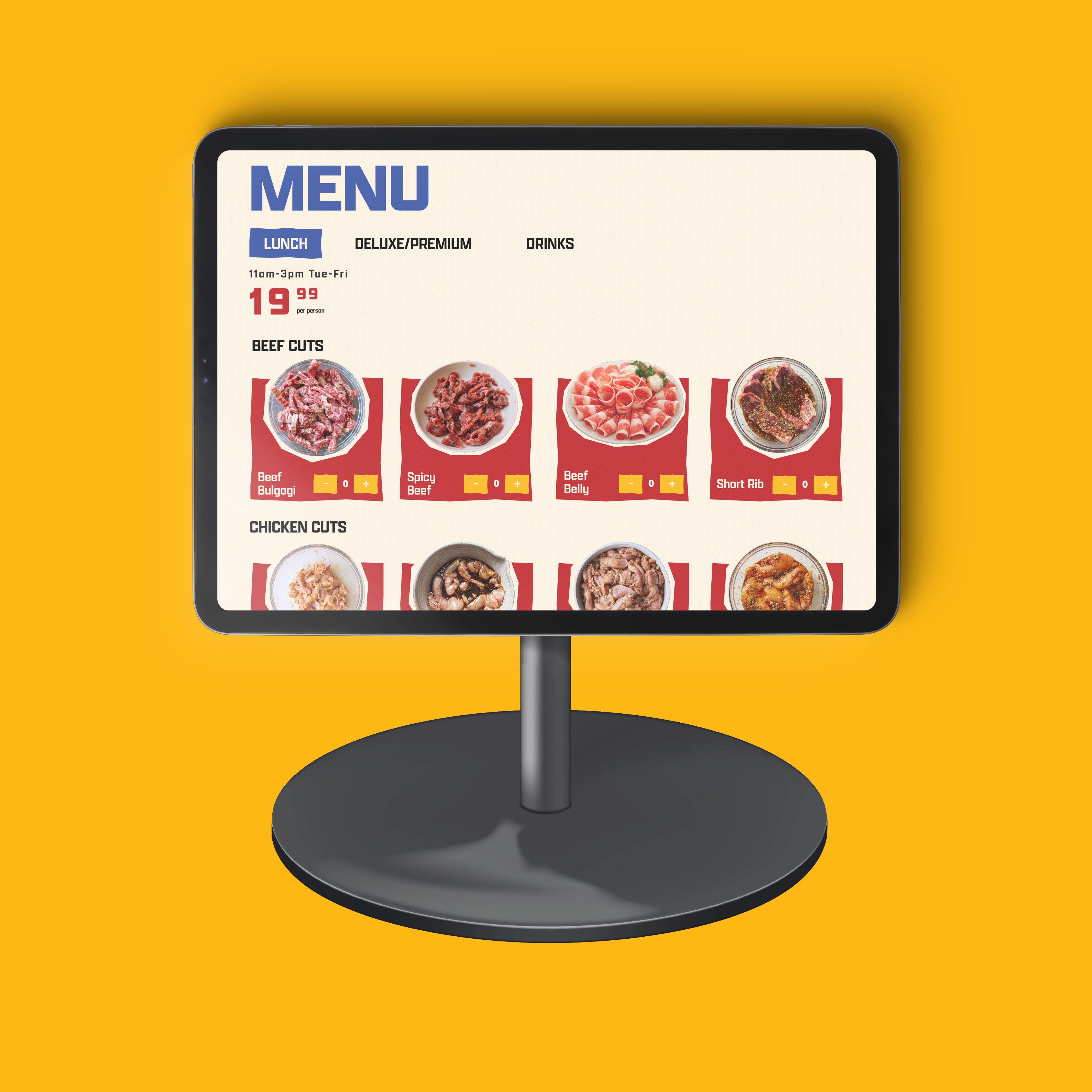
Printed Menu
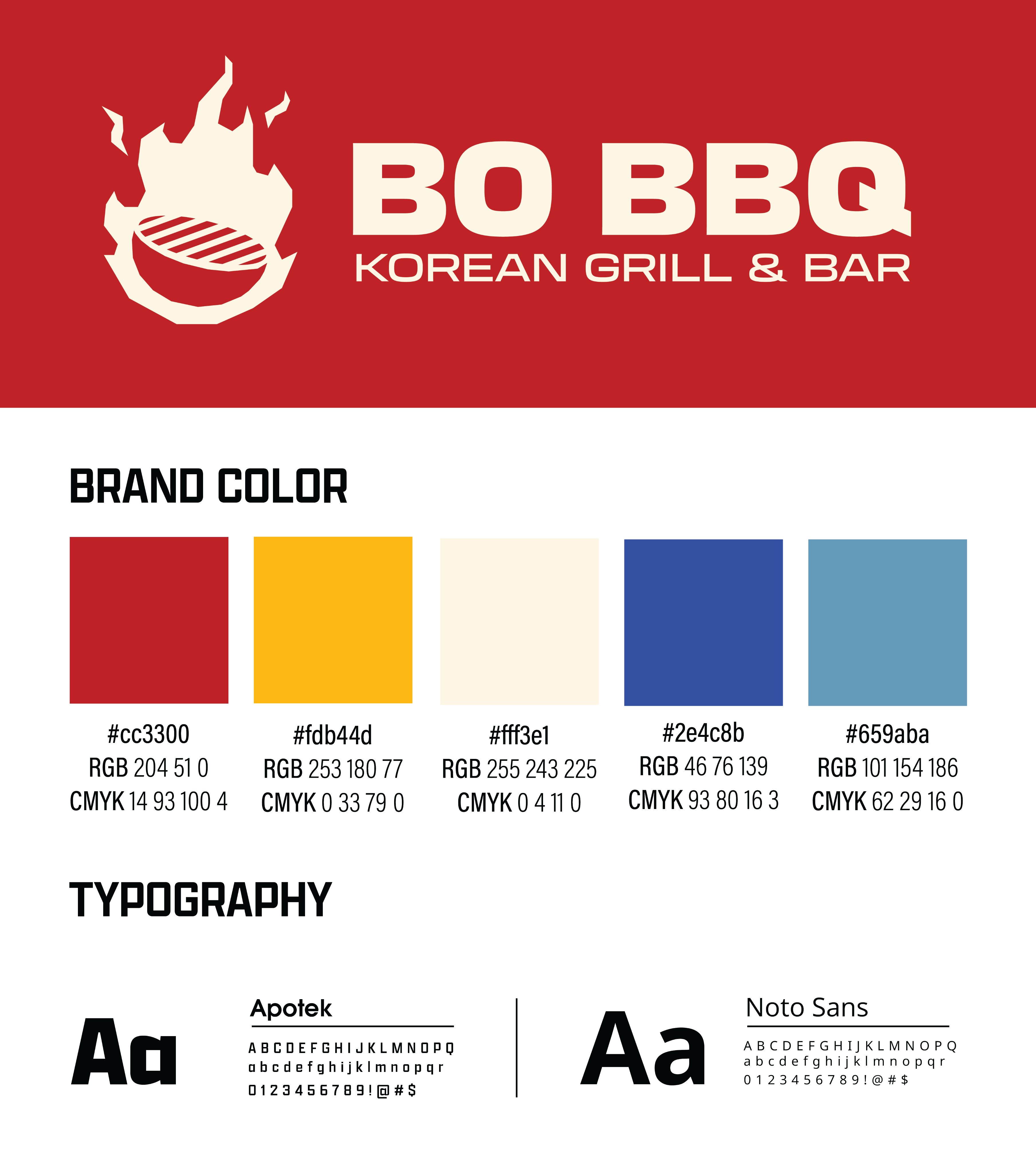
The BO BBQ brand identity reflects the bold energy and interactive spirit of Korean barbecue. The logo features a central grill surrounded by stylized flames, representing the restaurant’s signature tabletop grilling experience, while strong letterforms and a warm red palette evoke heat, flavor, and hospitality.
Supporting colors draw inspiration from rich marinades, rising grill smoke, and the cool metallic tones of cooking tools, balanced by a soft off-white that keeps the palette clean and inviting. Paired with the expressive Apotek typeface and the highly readable Noto Sans, the visual system combines personality with clarity. Combined these elements create a vibrant, cohesive brand that feels modern, welcoming, and easy to navigate for diners.
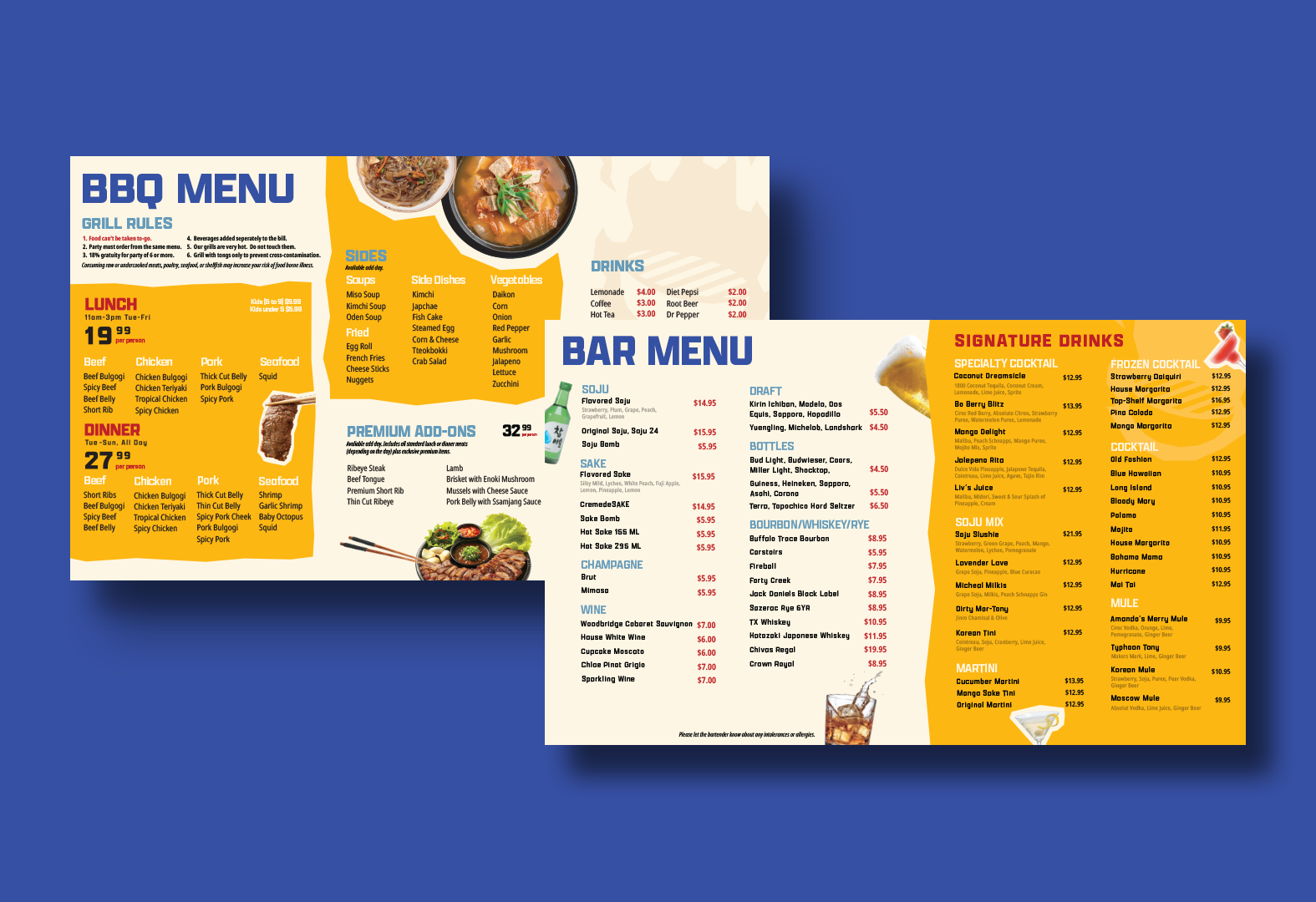
This redesigned menu works far better than the original because it brings clarity, hierarchy, and visual appeal to the forefront. The use of bold section headers, spacious layouts, and strategic color blocking makes it easy for customers to quickly navigate lunch, dinner, add-ons, sides, and drinks without feeling overwhelmed.
By reducing clutter, improving readability, and adding visual cues like icons and imagery, the redesigned menu not only enhances the dining experience but also makes the restaurant feel more polished, intentional, and memorable.
Project Type
Branding, Packaging, Print, Media
Role
Creative Director, Graphic Designer
Software Used
Adobe Illustrator, Adobe Photoshop, Figma
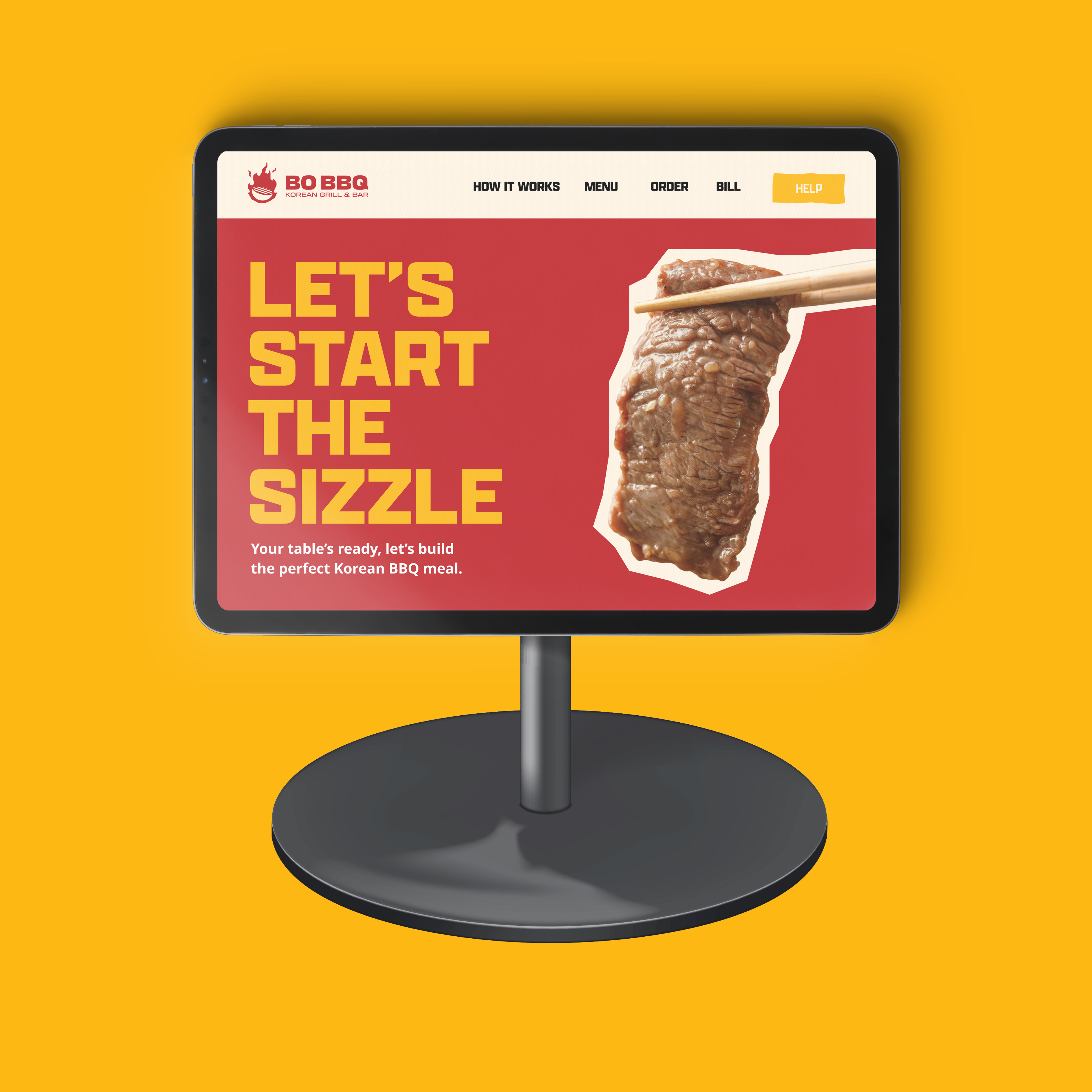
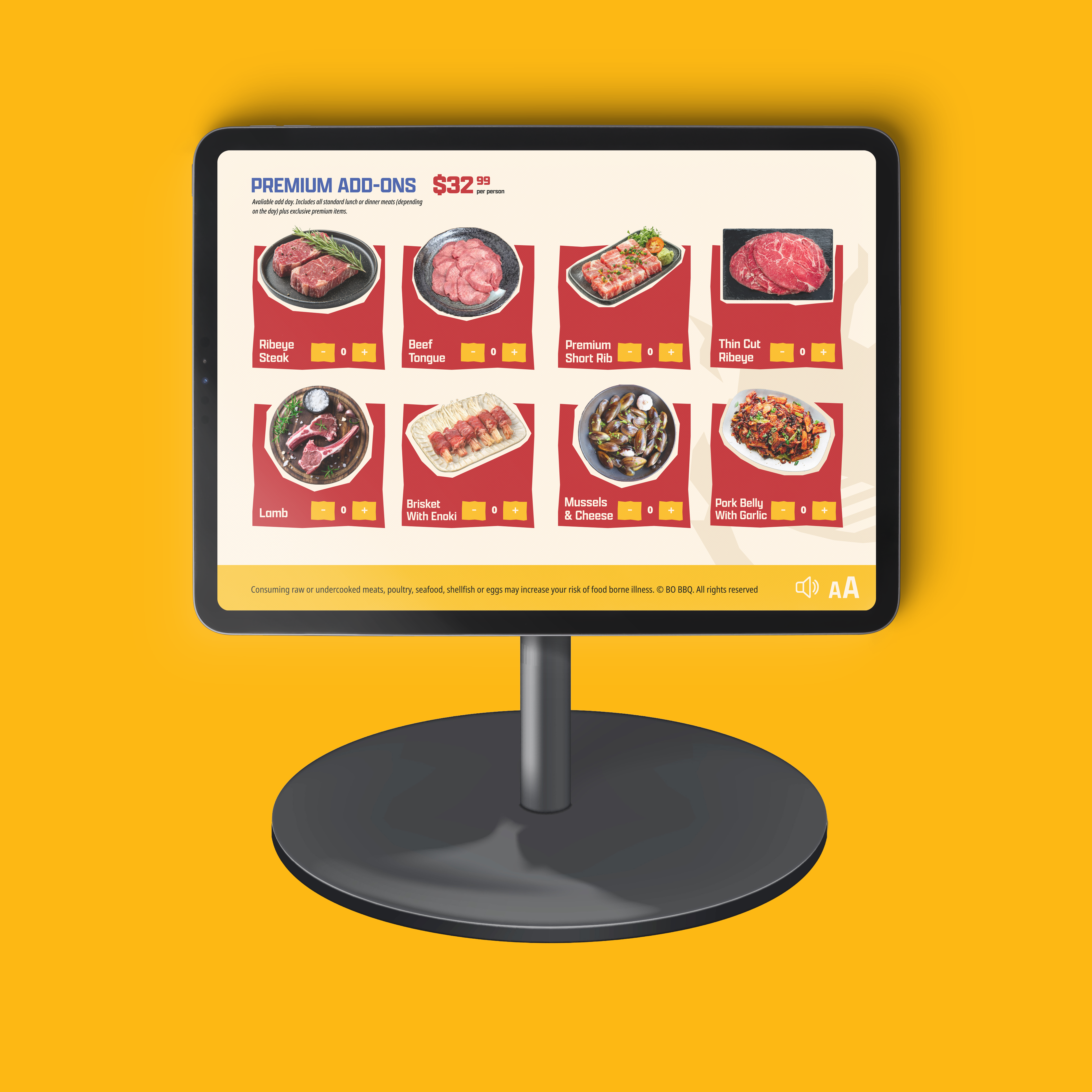
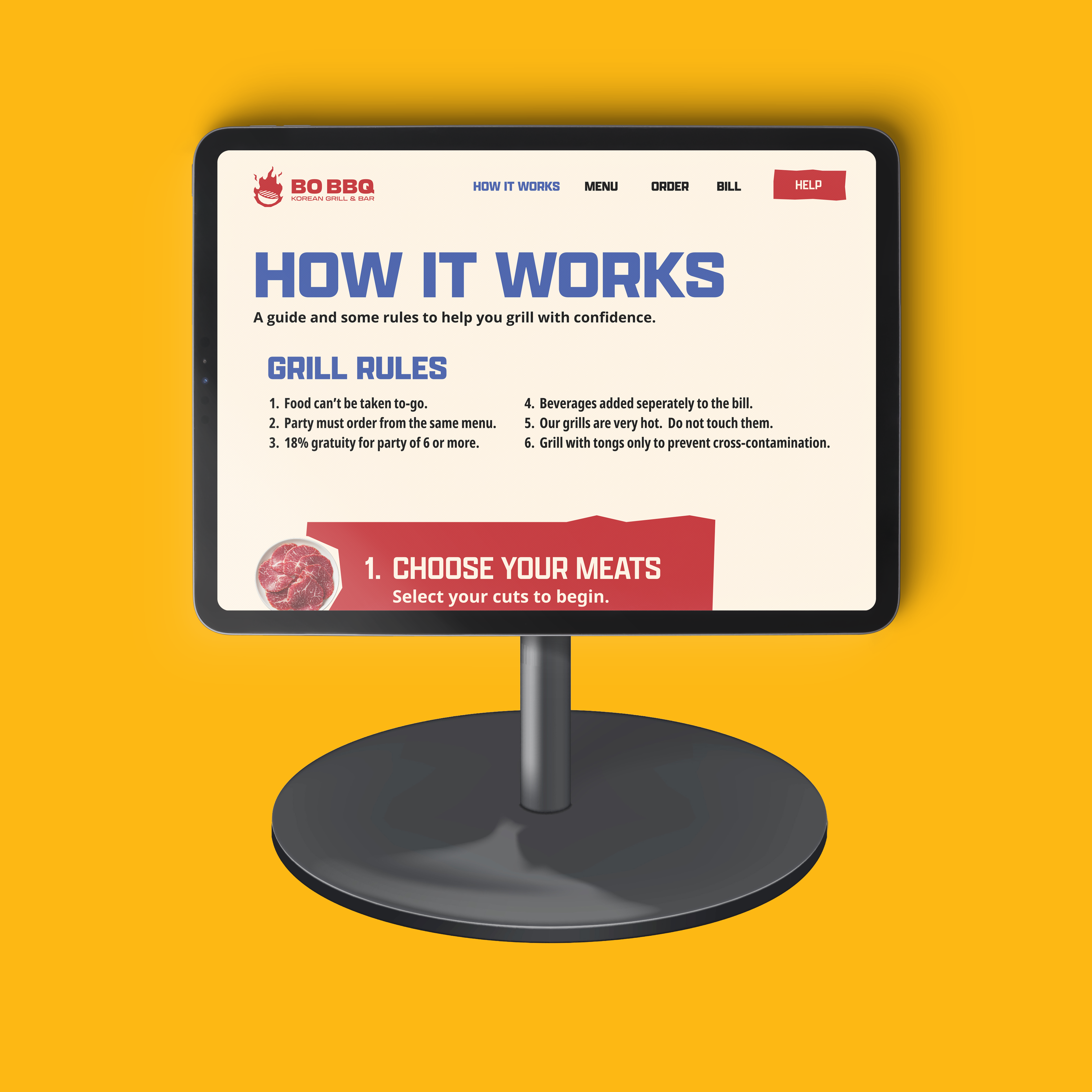
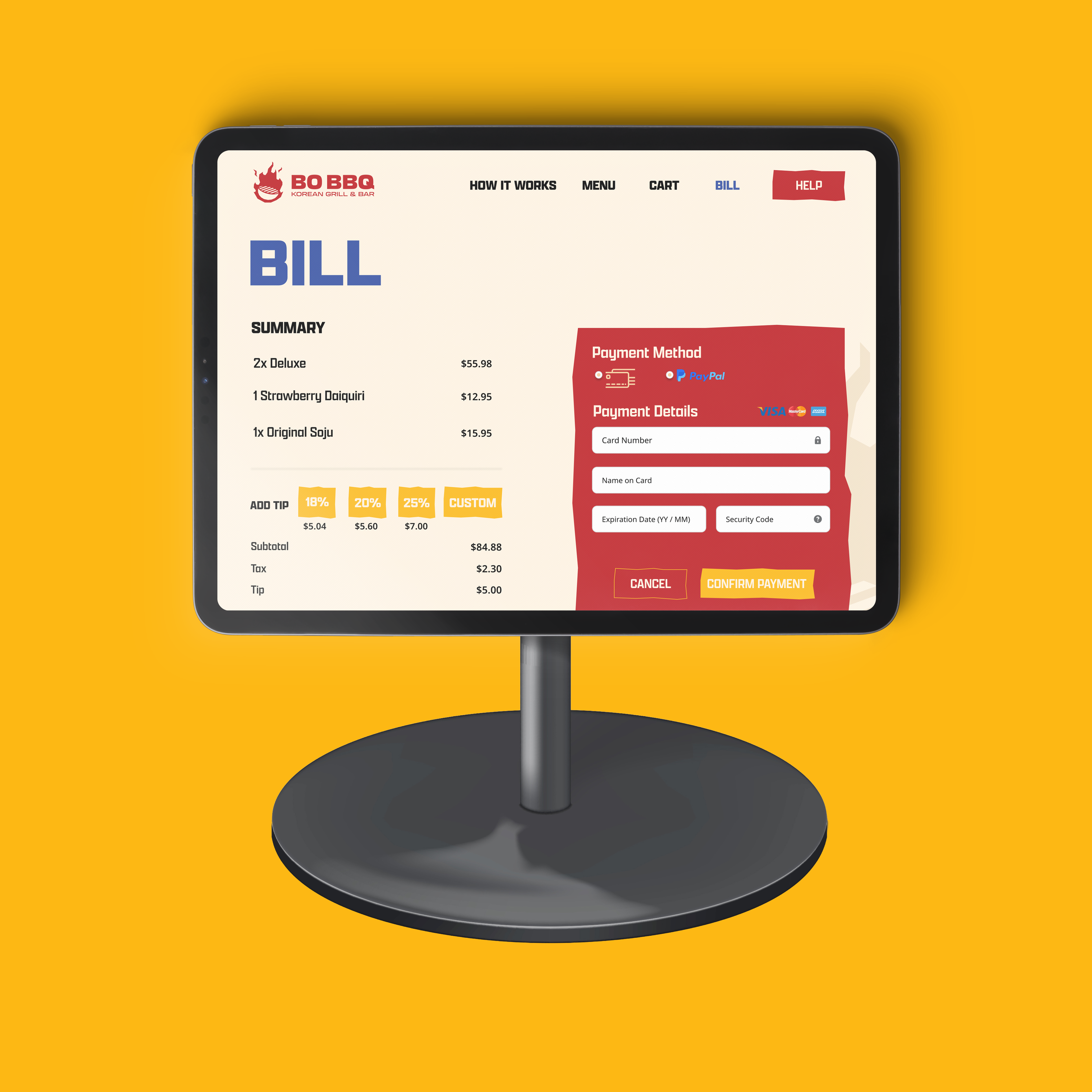
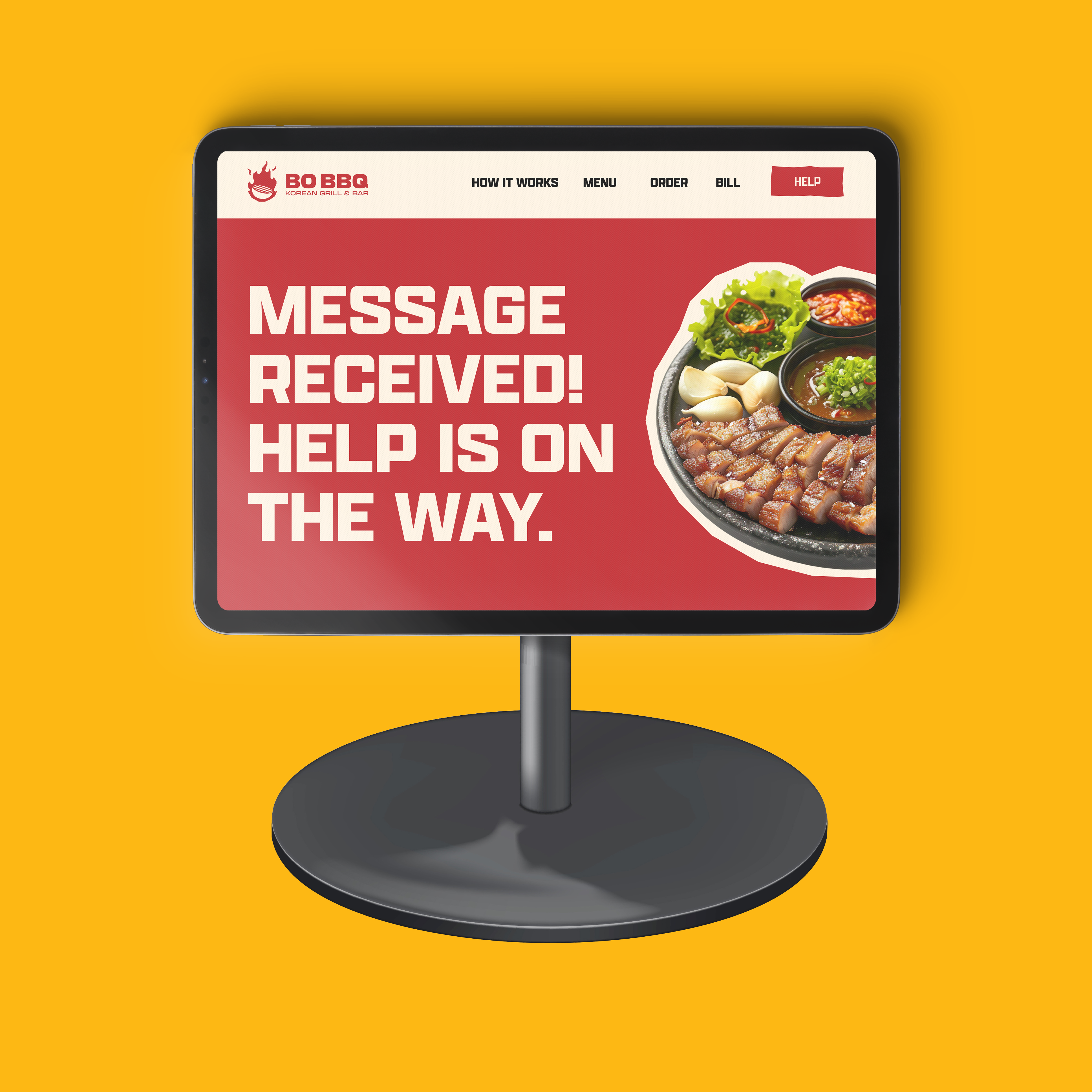
Information Visualization: Table Kiosk
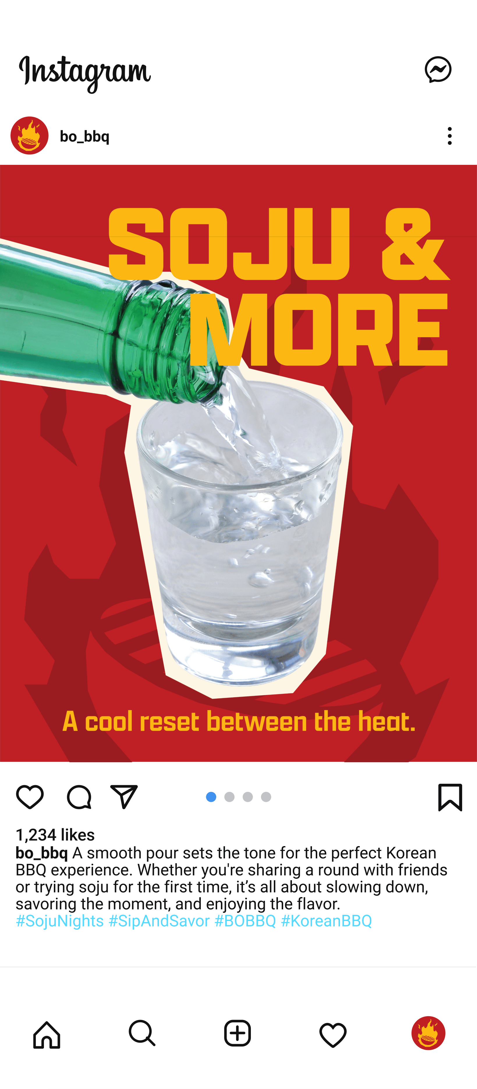
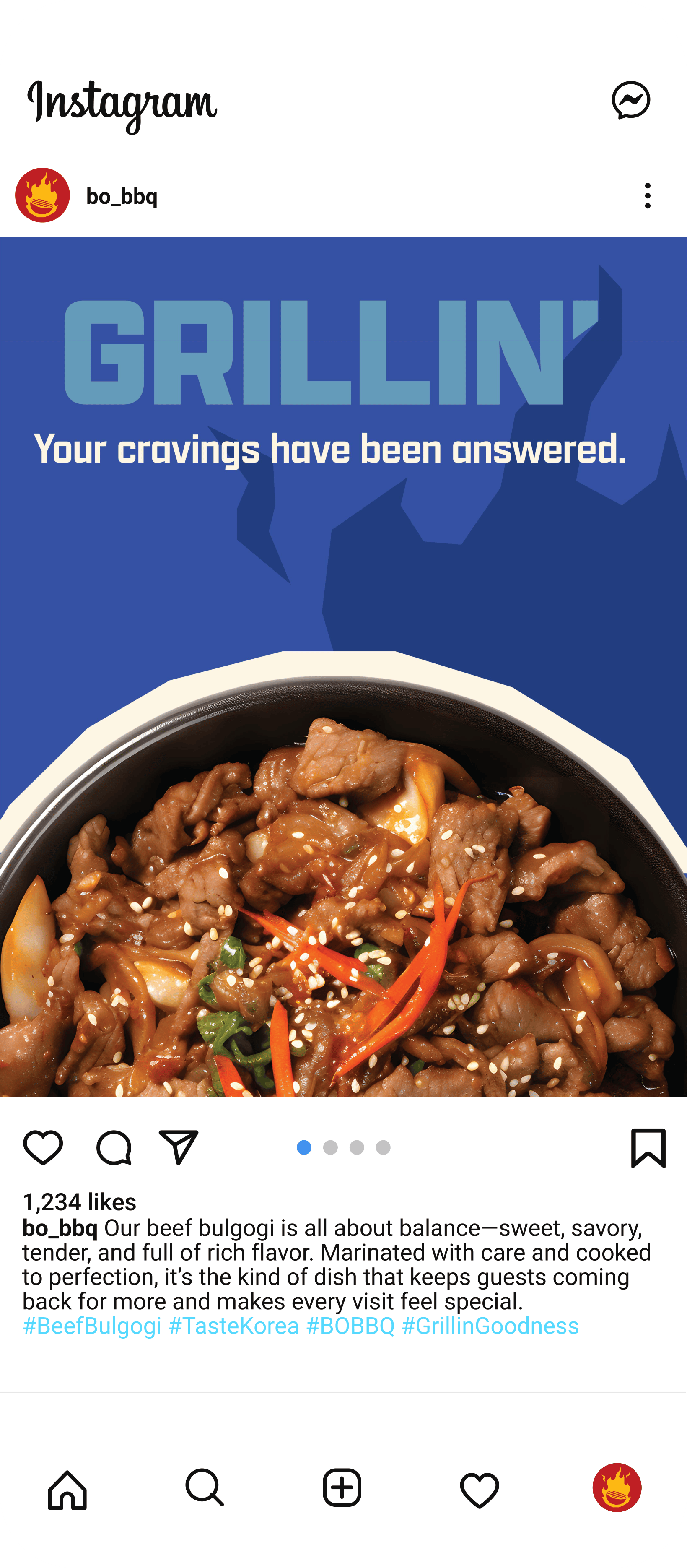
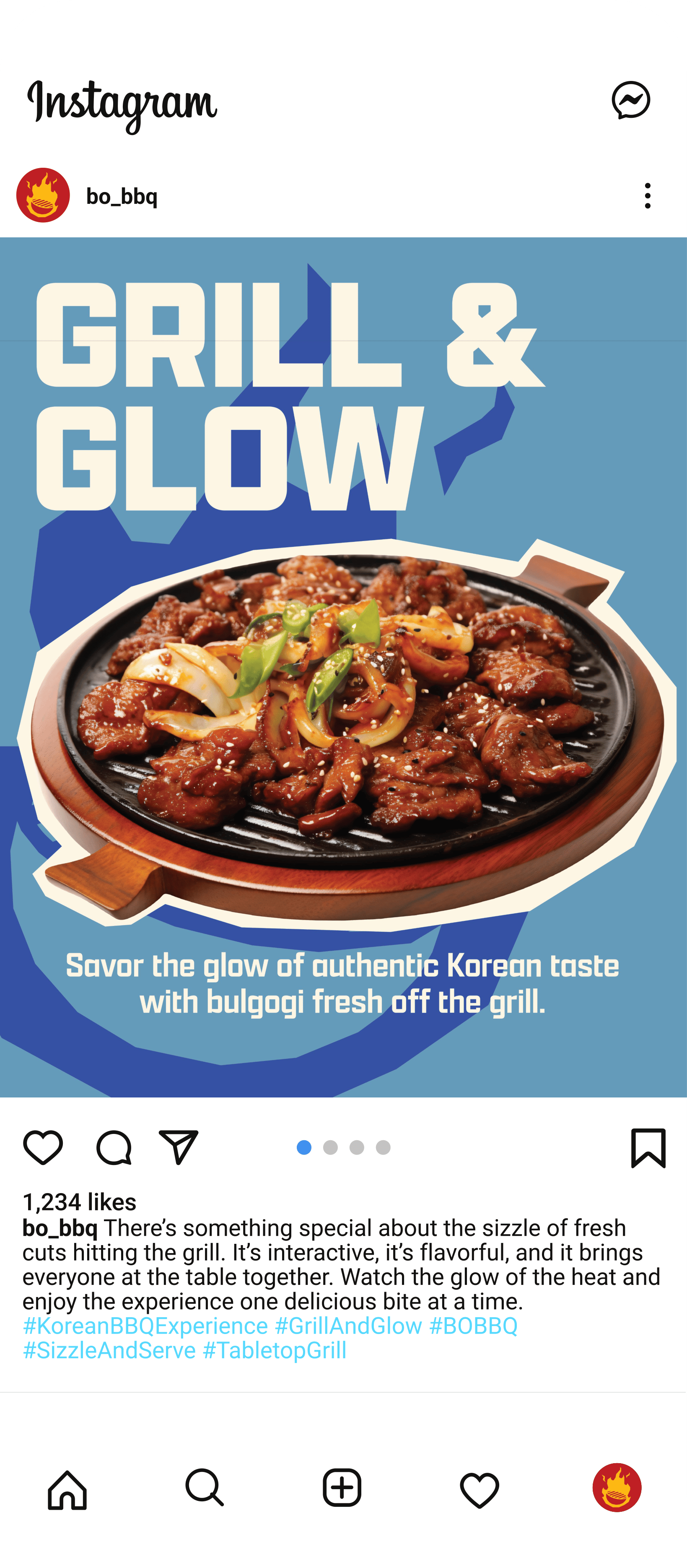
Social Media Marketing
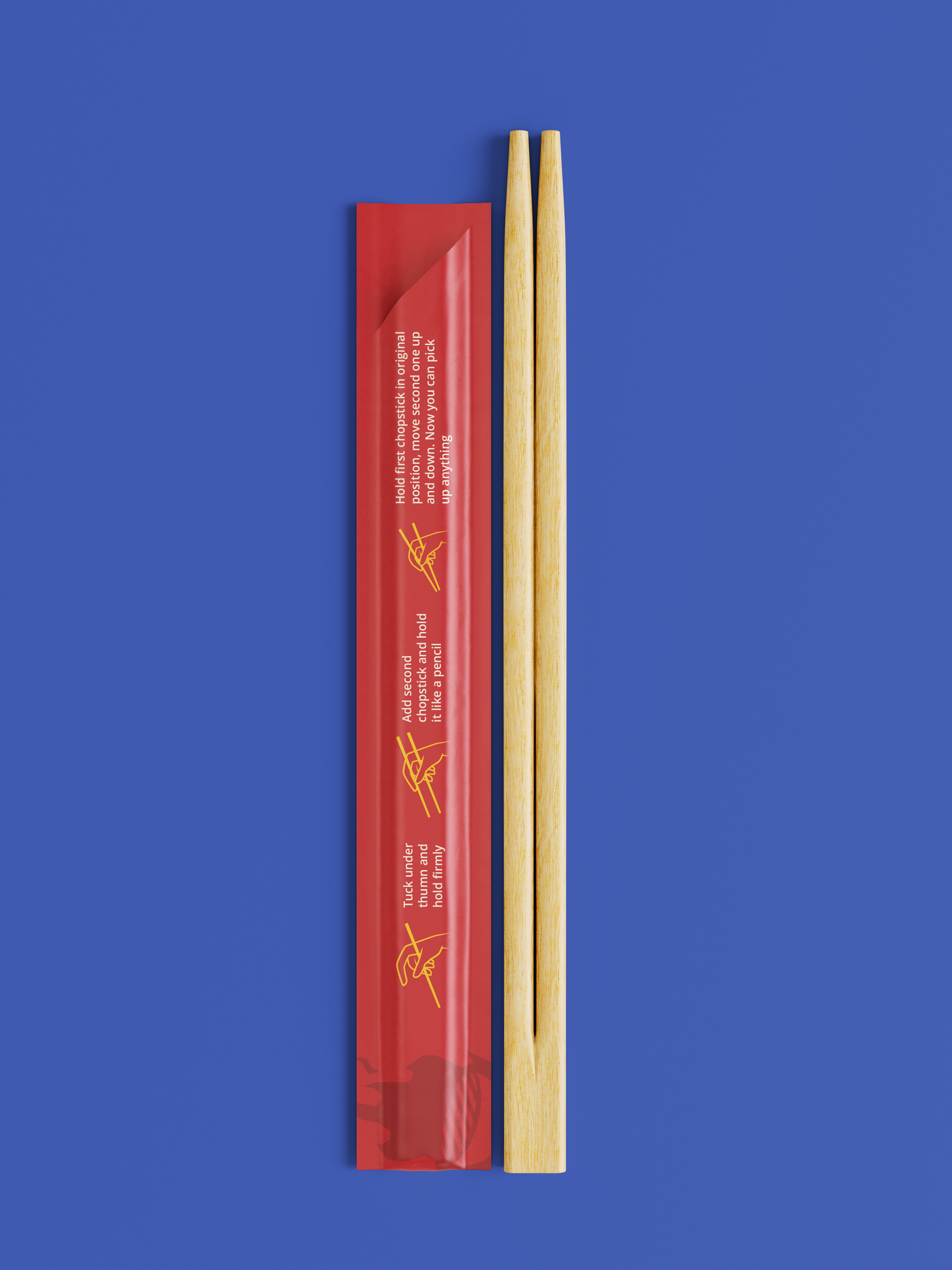
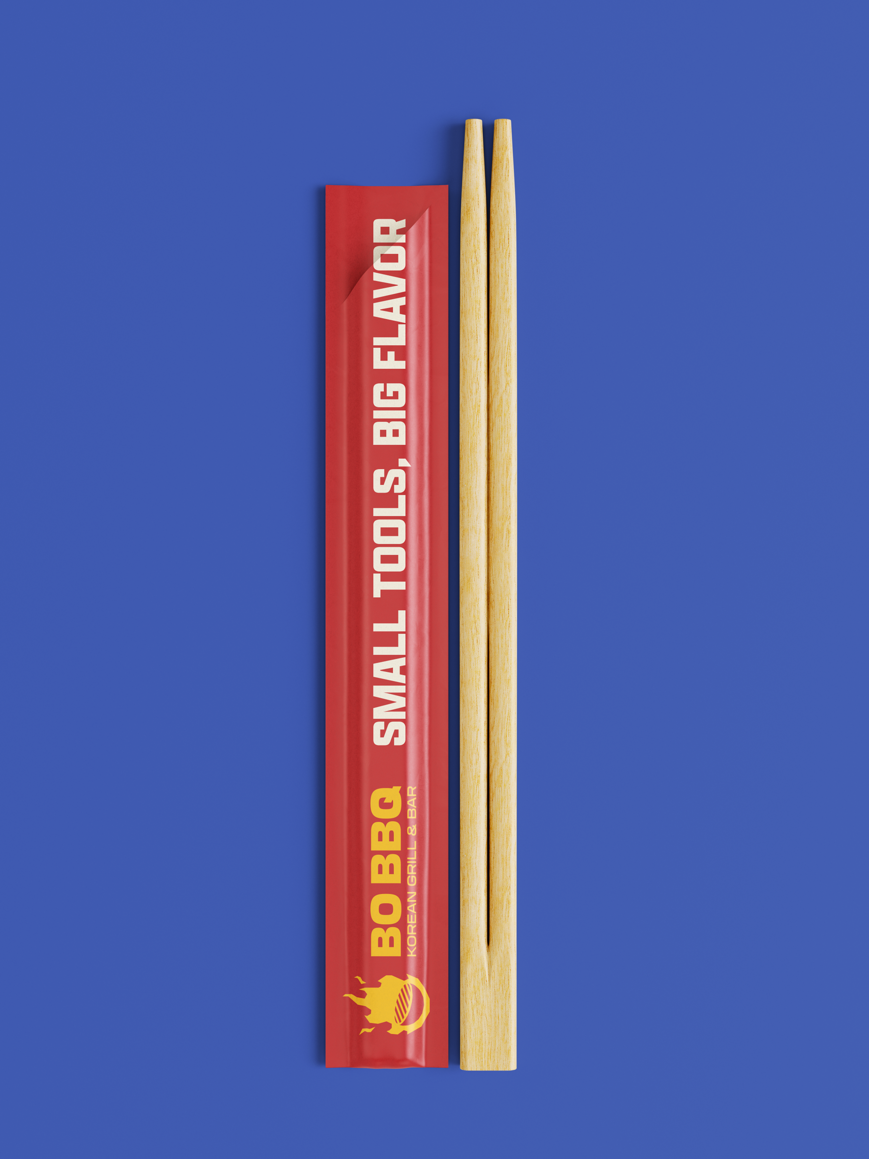
Packaging: Chopsticks
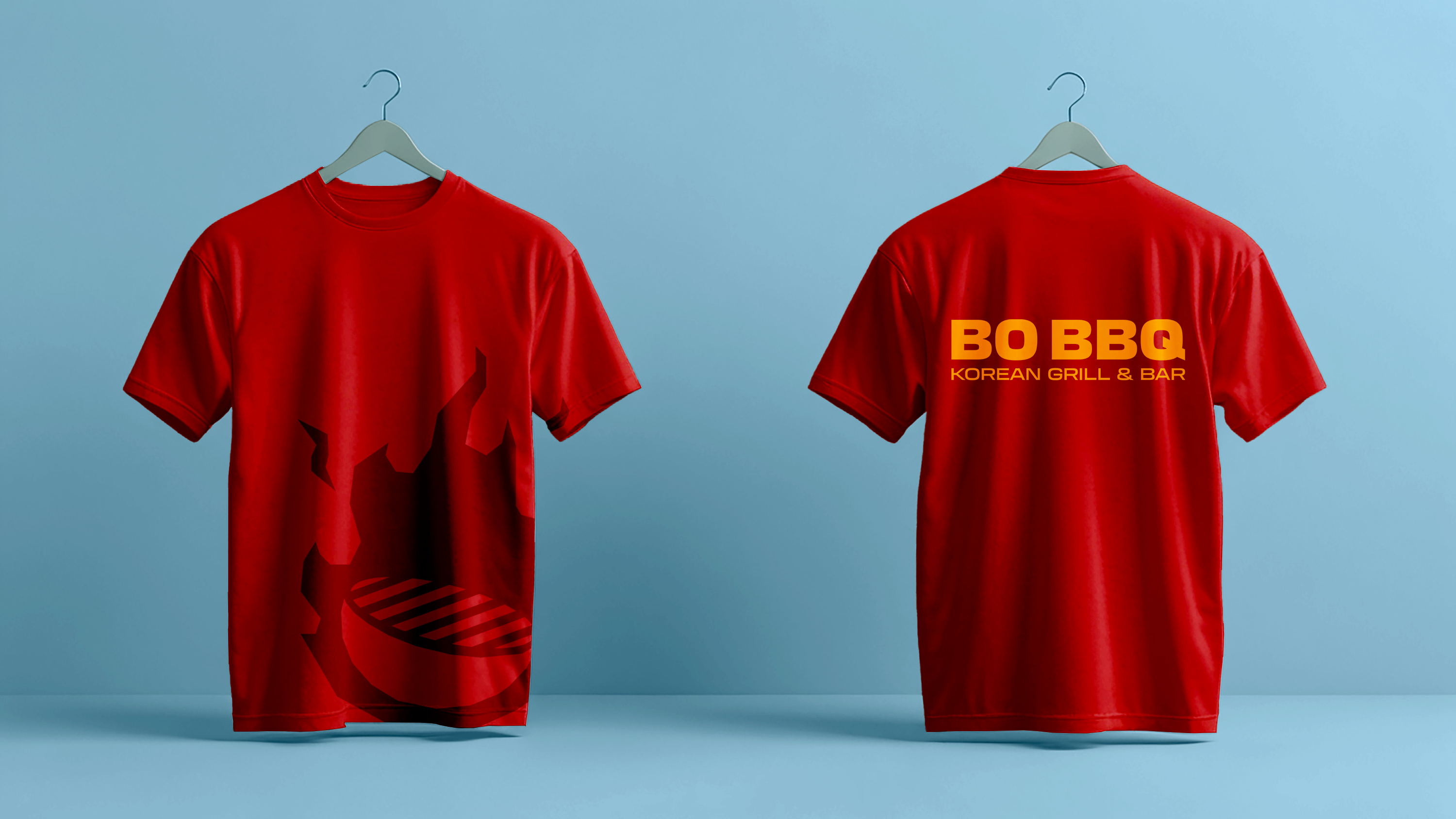
Ephemera: Employee T-Shirt
This redesigned menu works far better than the original because it brings clarity, hierarchy, and visual appeal to the forefront. The use of bold section headers, spacious layouts, and strategic color blocking makes it easy for customers to quickly navigate lunch, dinner, add-ons, sides, and drinks without feeling overwhelmed.
By reducing clutter, improving readability, and adding visual cues like icons and imagery, the redesigned menu not only enhances the dining experience but also makes the restaurant feel more polished, intentional, and memorable.
These three posts capture the heart of BO BBQ’s updated brand: bold flavors, welcoming experiences, and the signature sizzle that defines Korean BBQ. By highlighting what makes the restaurant unique, from the smooth pour of soju to the rich flavor of bulgogi and the energy of tabletop grilling, the visuals create a clear and memorable identity for the restaurant.
Thoughtfully designed chopstick packaging enhances the dining experience at BO BBQ by offering clear, friendly illustrations that show guests how to hold and use chopsticks with confidence. This small but meaningful detail helps ease intimidation for first-time diners and makes the meal more approachable, especially for those unfamiliar with Korean dining customs.
Employee T-shirts play an important role in extending BO BBQ’s new brand identity by carrying its colors, typography, and visual style into the customer-facing experience. A cohesive shirt design makes staff instantly recognizable, helping diners quickly identify servers, ask questions, and feel more supported throughout the meal. This visibility is especially valuable in a Korean BBQ setting, where guests may need guidance or reassurance.
Thank You!
This was created for a class project, with no affiliation to BO BBQ.
All images, logos, products, videos, and other copyrights or trademarks featured, mentioned, or referred to within the project are the property of BO BBQ. The use of the trade name, copyright, or trademark in my student portfolio for identification and reference purposes only and does not imply any association with the copyright or trademark holder of their product or brand. My work is not affiliated, associated, authorized, maintained, sponsored, endorsed by, or in any way officially connected with these copyright or trademark holders. BO BBQ does not sponsor or endorse any of the shown work. I declare no affiliation, sponsorship, nor any partnerships with any copyright or trademark holders.


Let’s
Menu
Portfolio
About
Contact
Connect
Behance
Dribble
Get in touch
alinadesign0018@gmail.com
© Copyright 2026. Alina/Design. All rights reserved.
Designed by Alina Shorter

Rosicrucian Egyptian Museum Rebrand
Project 01
Film Sphere Magazine
Project 02
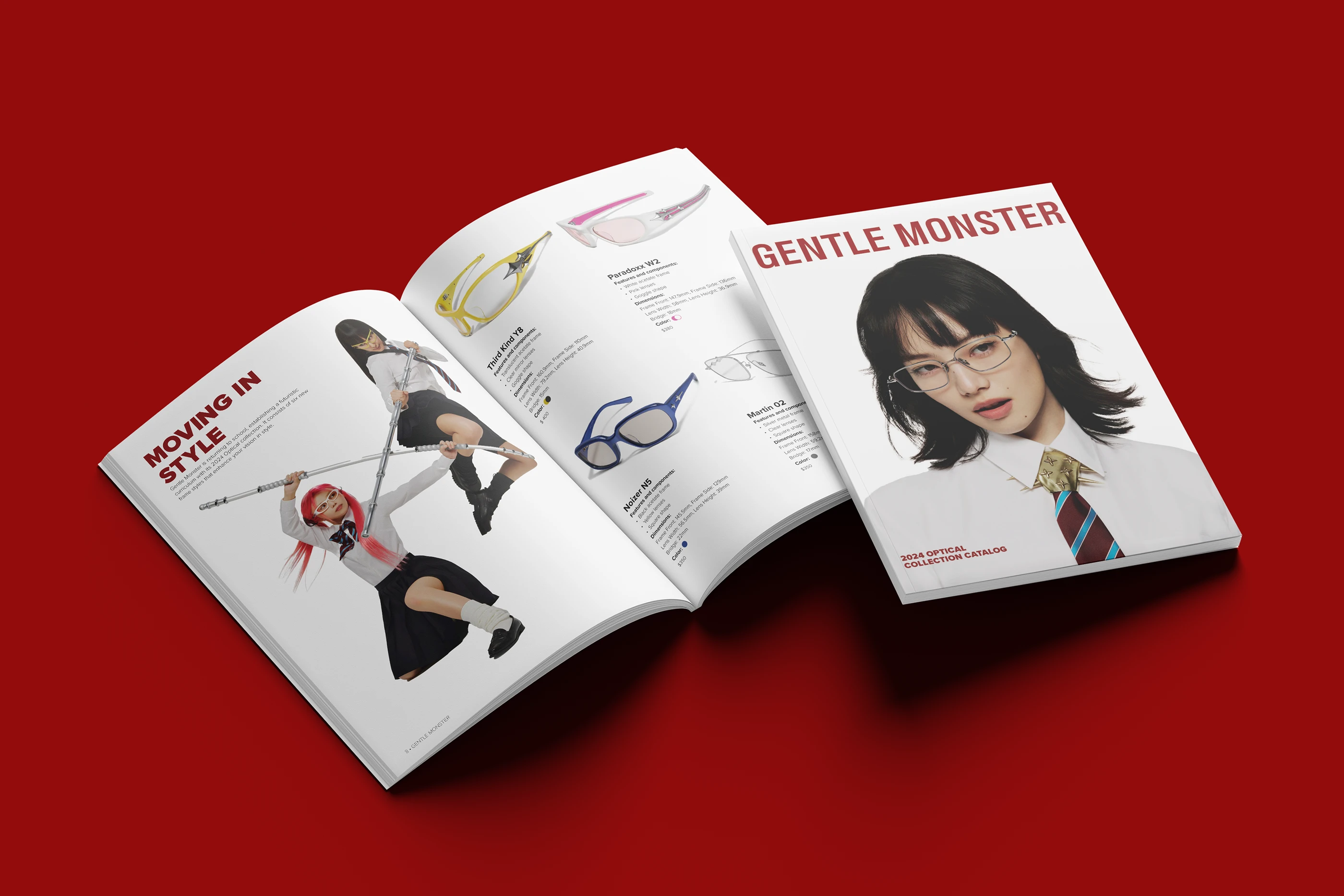
Gentle Monster Catalog
Project 04
Brand Identity
Experience Design: Printed Menu
Information Visualization: Table Kiosk
Social Media Marketing
Packaging: Chopsticks
Ephemera: Employee T-Shirt
BO BBQ
Rebrand
Project Type
Branding, Packaging, Print, Media
Role
Creative Director, Graphic Designer
Software Used
Adobe Illustrator, Adobe Photoshop, Figma
BO BBQ is a Korean BBQ restaurant in Corpus Christi, TX, offering an interactive dining experience where guests grill high-quality meats, seafood, vegetables, and traditional side dishes at their own tabletop grill. This project reimagines the restaurant’s brand identity and customer experience through cohesive design, including updated menus, environmental graphics, wayfinding, and digital ordering.
The goal is to make Korean BBQ more approachable for first-time diners while strengthening brand recognition and creating a smoother, more engaging experience for returning guests.
The BO BBQ brand identity reflects the bold energy and interactive spirit of Korean barbecue. The logo features a central grill surrounded by stylized flames, representing the restaurant’s signature tabletop grilling experience, while strong letterforms and a warm red palette evoke heat, flavor, and hospitality.
Supporting colors draw inspiration from rich marinades, rising grill smoke, and the cool metallic tones of cooking tools, balanced by a soft off-white that keeps the palette clean and inviting. Paired with the expressive Apotek typeface and the highly readable Noto Sans, the visual system combines personality with clarity. Combined these elements create a vibrant, cohesive brand that feels modern, welcoming, and easy to navigate for diners.
This redesigned menu works far better than the original because it brings clarity, hierarchy, and visual appeal to the forefront. The use of bold section headers, spacious layouts, and strategic color blocking makes it easy for customers to quickly navigate lunch, dinner, add-ons, sides, and drinks without feeling overwhelmed.
By reducing clutter, improving readability, and adding visual cues like icons and imagery, the redesigned menu not only enhances the dining experience but also makes the restaurant feel more polished, intentional, and memorable.
These three posts capture the heart of BO BBQ’s updated brand: bold flavors, welcoming experiences, and the signature sizzle that defines Korean BBQ. By highlighting what makes the restaurant unique, from the smooth pour of soju to the rich flavor of bulgogi and the energy of tabletop grilling, the visuals create a clear and memorable identity for the restaurant.
Thoughtfully designed chopstick packaging enhances the dining experience at BO BBQ by offering clear, friendly illustrations that show guests how to hold and use chopsticks with confidence. This small but meaningful detail helps ease intimidation for first-time diners and makes the meal more approachable, especially for those unfamiliar with Korean dining customs.
Employee T-shirts play an important role in extending BO BBQ’s new brand identity by carrying its colors, typography, and visual style into the customer-facing experience. A cohesive shirt design makes staff instantly recognizable, helping diners quickly identify servers, ask questions, and feel more supported throughout the meal. This visibility is especially valuable in a Korean BBQ setting, where guests may need guidance or reassurance.
Thank You!
This was created for a class project, with no affiliation to BO BBQ.
All images, logos, products, videos, and other copyrights or trademarks featured, mentioned, or referred to within the project are the property of GBO BBQ. The use of the trade name, copyright, or trademark in my student portfolio for identification and reference purposes only and does not imply any association with the copyright or trademark holder of their product or brand. My work is not affiliated, associated, authorized, maintained, sponsored, endorsed by, or in any way officially connected with these copyright or trademark holders. BO BBQ does not sponsor or endorse any of the shown work. I declare no affiliation, sponsorship, nor any partnerships with any copyright or trademark holders.
More Projects
Let’s Collab.
Menu
Connect
Get in touch
Portfolio
alinadesign0018@gmail.com
Behance
Dribble
About
Contact
© Copyright 2026. Alina/Design. All rights reserved.
Designed by Alina Shorter


Rosicrucian Egyptian Museum Rebrand
Project 01
Film Sphere Magazine
Project 02
Gentle Monster Catalog
Project 04